Safer Together — Rebuilding a member organisation’s website to align organisational change with its proposed future roadmap.


Opportunity
Since the last website build, Safer Together's operations and initiatives, as a member organisation, had evolved significantly. As a result, there was a need to update their existing website to better service the Natural Gas Exploration and Production industry and its members. There was an opportunity to create a valuable asset for members to engage with the industry group as the primary point of engagement. Safer Together needed a new website to realign their organisational online presence with their future direction.

Approach
Extensive user mapping was conducted to inform how to best serve a myriad of audiences and provide the best experience. Four main user groups were identified including member organisations, member workers, non-members and Safer Together staff - each with their own user stories defined.
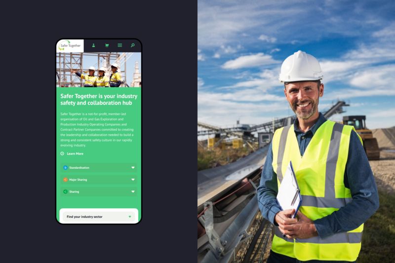
Insights from this work informed the strategic direction of Safer Together’s website rebuild, leading to a number of key considerations reflecting organisational objectives. Engaging individual workers of member organisations to actively participate in conversations with Safer Together was a key focus, while also accelerating the adoption of Safer Together initiatives. The goal of this was to create demand from the bottom up through a ‘pull’ mechanism.
Other key requirements were for the website to give members more control over their membership through a self-serving interface, as well as the personalisation of content to maximise value. The experience also needed to appeal to a wide range of less tech-savvy users.

Solution
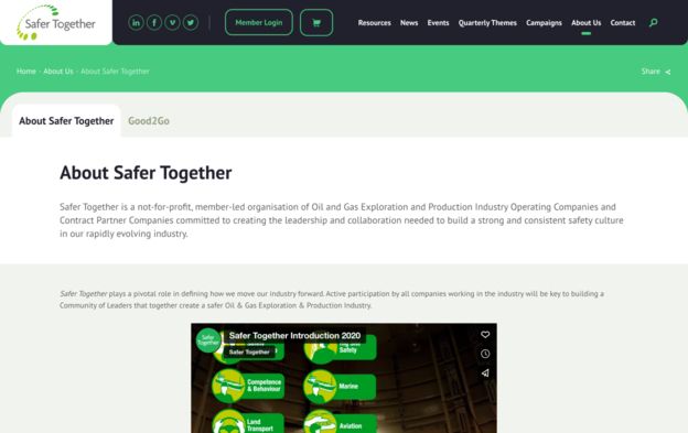
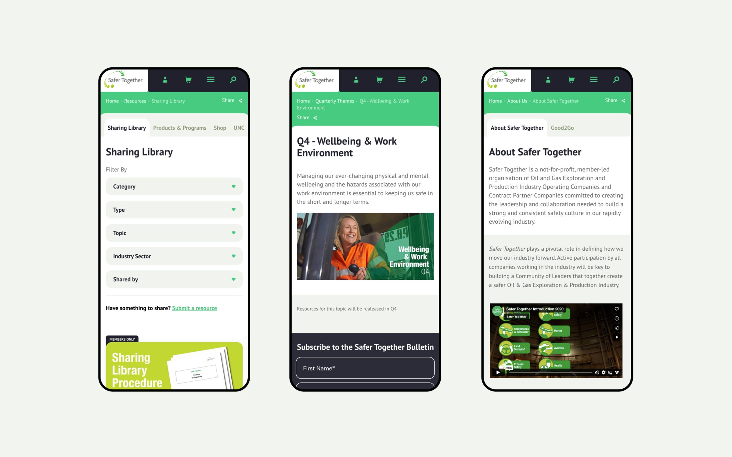
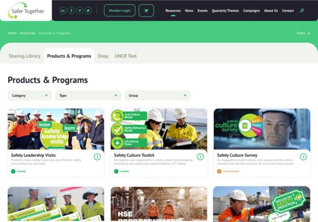
The solution consisted of two components: a public website to communicate the member organisation’s value proposition (to the industry and international peers), and a dedicated member portal for users to access additional resources as part of their membership.
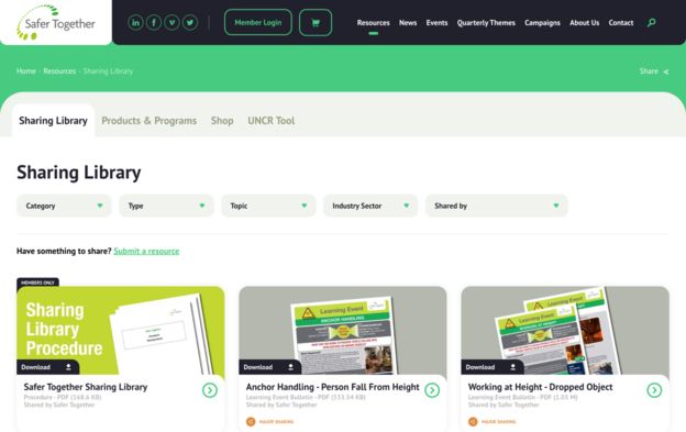
The decision to create a member portal was ultimately to gatekeep membership benefits, such as special pricing for products and access to Working Group initiatives. Other key functionality included a sitewide search function to accommodate the breadth of content for both members and non-members. Category and tag filters were also implemented to address specific content navigation and sorting. Additionally, filtering was used on the member dashboard for members to nominate specific areas of interest which would conveniently display the relevant content.
Ecommerce was another key feature on the website, enabling the purchasing of training material, surveys and toolkits. Furthermore, a number of opportunities for users to contact Safer Together were integrated into the website using forms and a newsletter sign-up and safety alert subscription. Once implemented, this would facilitate communication and encourage member involvement to foster a strong relationship.


Services & Expertise
- Website and Digital strategy
- Strategic Website Consulting
- Stakeholder engagement
- Competitor & peer reviews
- User interviews, focus groups & surveys
- User journey mapping
- Information architecture
- User experience design
- User experience (UX) design
- User interface (UI) design
- Website Design Wireframing
- Website and Web-app Prototyping
- Development, Integrations & Hosting
- Web development
- API integration
- Website Performance & Optimisation
- Data and analytics
- Website Security
- Maintenance and support

