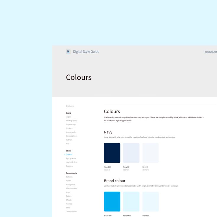
Harcourts International — A refreshed digital presence to accommodate an international franchise network.


Opportunity
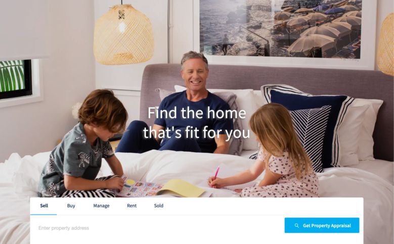
As an international franchise network, Harcourts engaged us for the UI/UX design of their new global platform, serving users across New Zealand, South Africa, and USA. Prior to this, there was no standardised way for agents to create individual websites, leading to inconsistencies in the brand experience. To carry out the project, we partnered with Australia’s industry leading proptech group, Website Blue, to deliver a world-class solution as we contributed our expertise in UI and UX design.









Approach
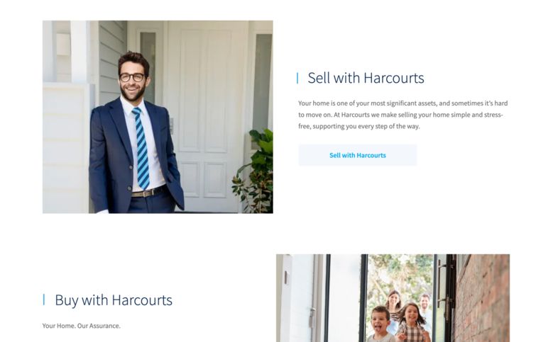
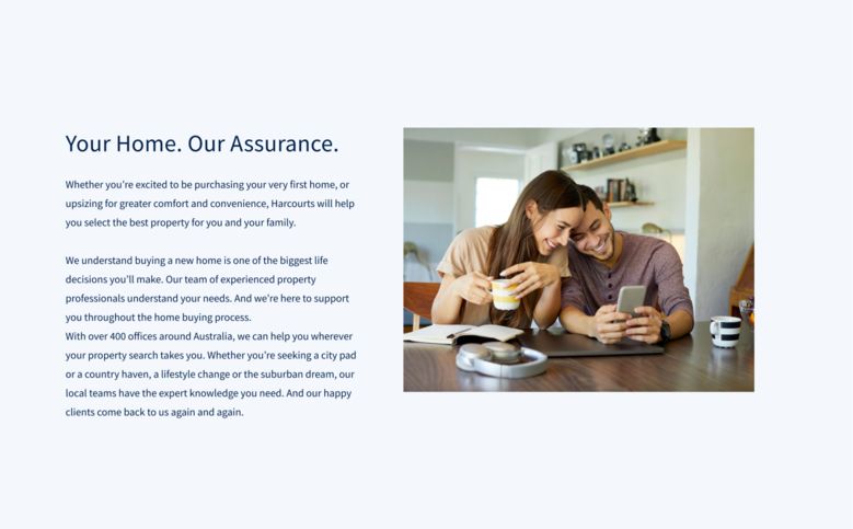
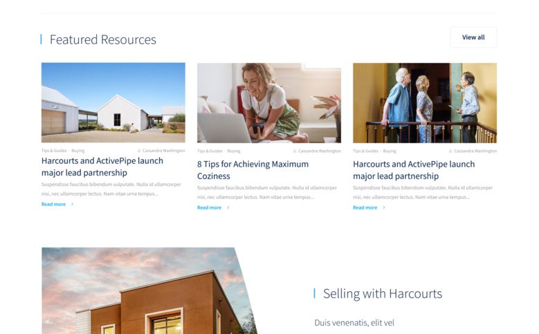
A disparate number of websites—all lacking brand coherence—were to be consolidated into a single platform. This worked to the advantage of both the Harcourts management team and the customer, while maintaining a degree of creative flexibility and autonomy to support each franchisee’s endeavour.
Knowing that the website would be serving users all over the world, user testing was a key focus. Using lo-fi prototypes, we tested a number of areas that formed a core part of the experience to gain feedback and insights.

Solution
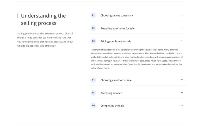
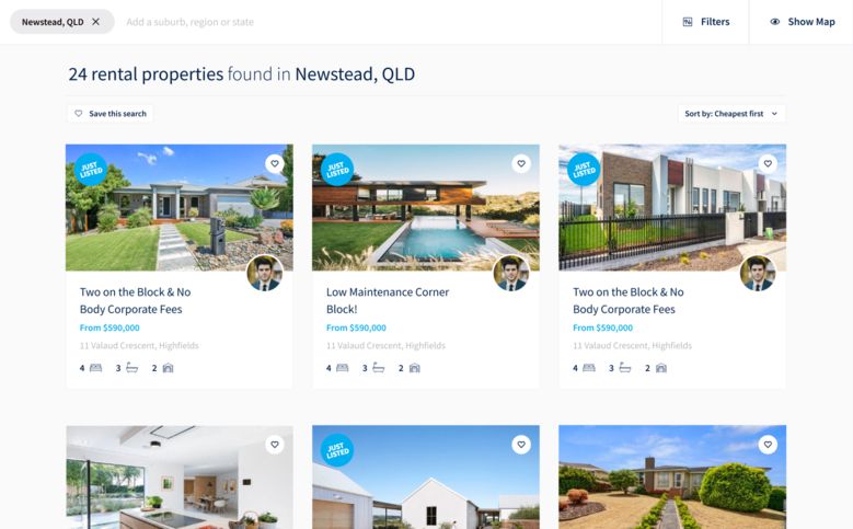
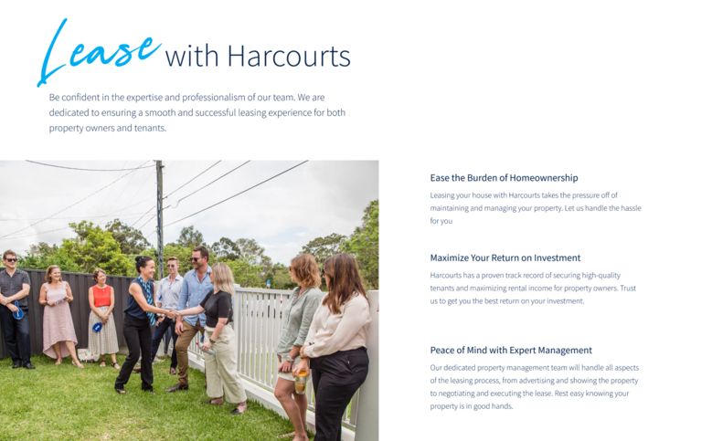
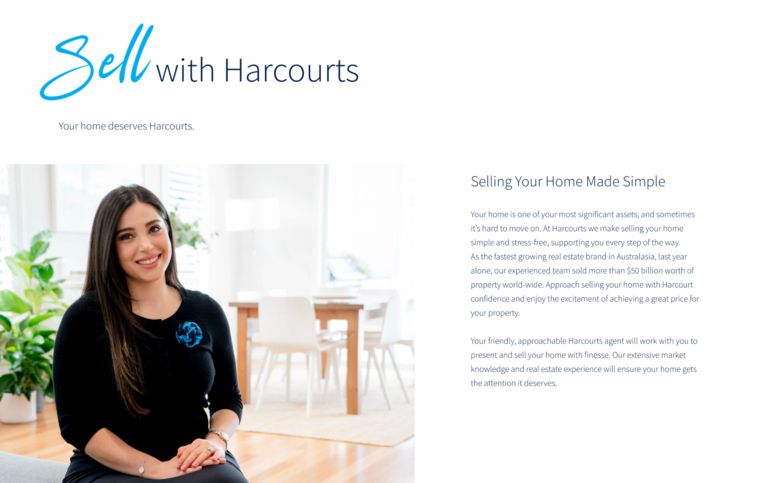
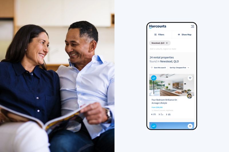
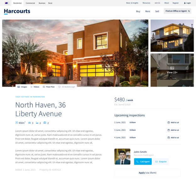
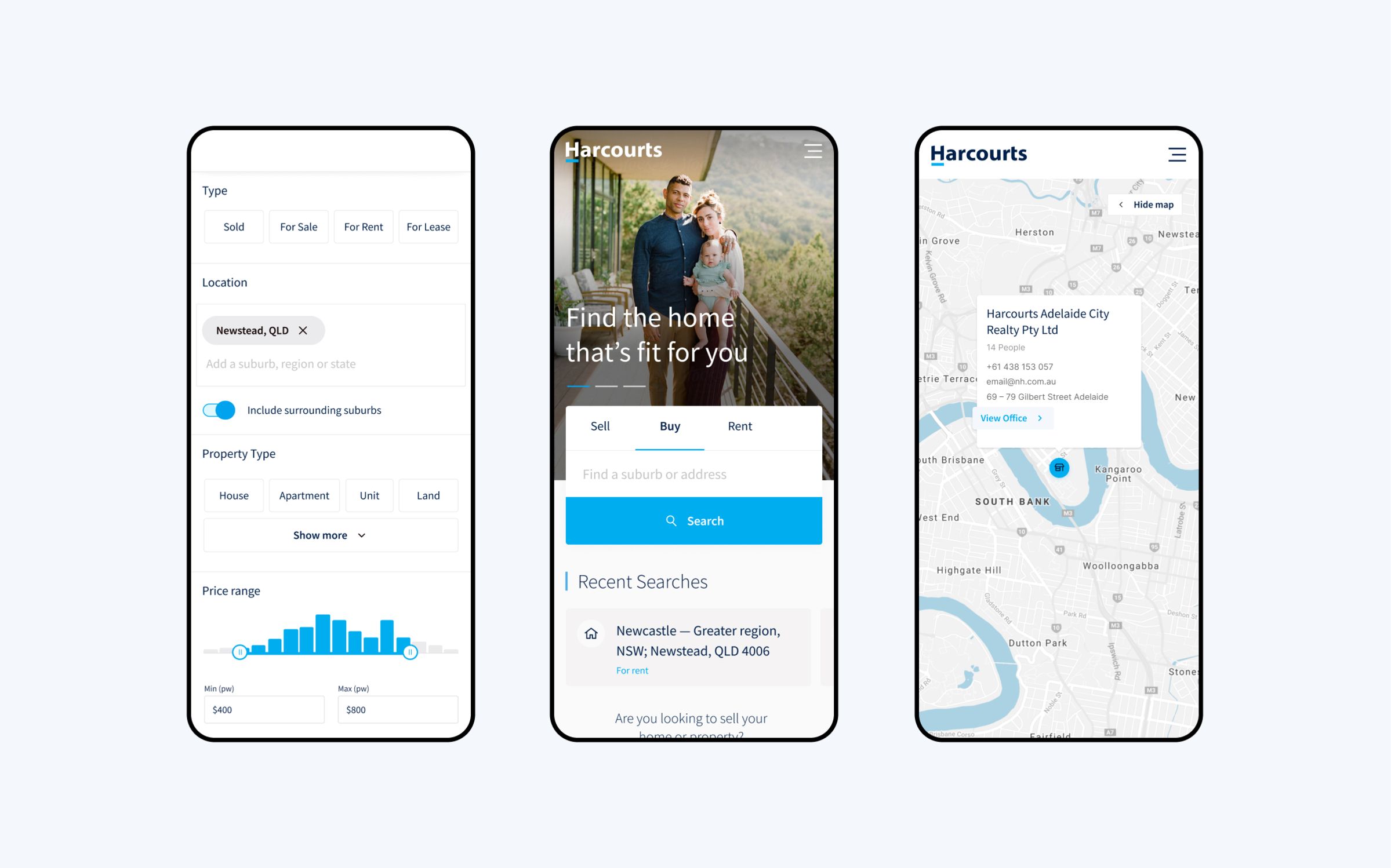
With agent sub-sites being a key focus of the project, property search was also a major piece. A custom search was created using custom element design, ensuring that users would be able to carry out tailored searches. Knowing that many of the sub-sites would need to be edited by multiple admins (i.e. agents), we designed the pages in a modular way to allow for easy editing. Interchangeable patterns with simple blocks on the page builder were also leveraged.
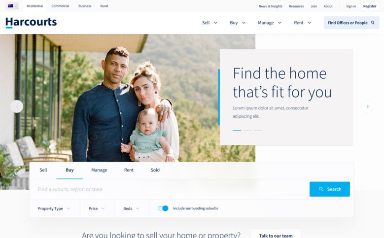
Being an international website, special consideration was also given to incorporating features that would accommodate a broad user base. A country and language selector was implemented.
Furthermore, Harcourts’ commercial and rural brands needed to be incorporated into the website. Each with their own unique brand, the decision was made to design their websites using the same structure as the main website but with an amended colour palette. This worked to unify all three brands without losing key brand elements.

Outcome
Two months post-launch, the new Harcourts’ website received in excess of 8200+ enquiries.

Services & Expertise
- Website and Digital strategy
- Stakeholder engagement
- Competitor & peer reviews
- User interviews, focus groups & surveys
- Information architecture
- User experience design
- User experience (UX) design
- User interface (UI) design
- Website and Web-app Prototyping
- Design systems

